
Patterns
Page sections
Whole parts of a page, built from the pieces.
Card shelf
A horizontal row with a heading and chevrons that move through activities, businesses, or collections.
Popular activities near ‘Portland’
No-School-Day Art Camp
Happy MakersFri, Oct 9, Ages 6–10$95 for the dayBasecamp
Trackers EarthSat, Oct 3–24$85 for the dayMuseum Day Camps
OMSIFri, Oct 9$105 for the dayCircus Theater Camp
Echo Theater CompanyFri, Oct 9, Ages 6–12$90 for the dayOutdoor Adventures
Trackers EarthFri, Oct 9$95 for the dayFirst Stage
Northwest Children’s TheaterFri, Oct 9, Ages 4–6$60 for the dayMini Circus Theater
Echo Theater CompanySat, Oct 10, Ages 4–9$45 for one visit


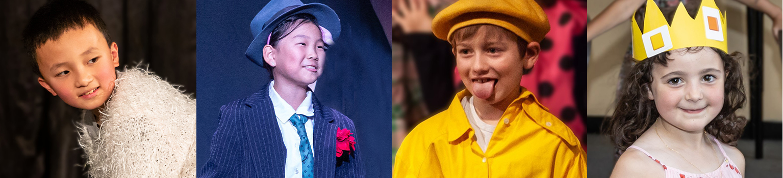
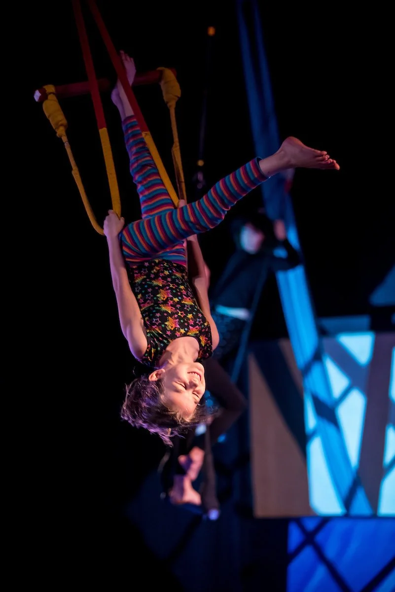
Medium, a business’s Current activities
Current activities, 3
Open Studio
Happy MakersSat, Oct 10, All ages$25 for one visitHands-on Museum
Experiment PDXSat, Oct 10, All ages$12 for one visitScience Buddy
Experiment PDXSat, Oct 3–24, Grades 2–5$40 for one class
Nothing to show: the empty line in place of the row
Saved for later
Nothing saved yet Tap the bookmark on any activity to keep it.
Loading: card shapes of its size under the real heading
Popular activities near ‘Portland’
Show details
- The Explore frame’s activity rows and its annotation asking for business-row chevrons. The row scrolls inside its own width, with cards snapping into place.
- The title is the section heading every page uses (the section step in Display Medium at every width, since October 19; Hannah, October 7: the frame’s 22px bold step was replaced by the library scale), with an optional count beside it in the muted ink, as rec.us heads its rows. Since October 29 (Hannah) the controls are plain chevrons as tall as the title’s line (Icon button plain, inline; a lightly tinted circle around them was tried and removed the same day). Controls appear only when the row overflows and disable at either end. Reduced motion scrolls immediately.
- On Explore the shelves run past the column’s padding to the screen’s edge (Hannah, October 8), and every shelf is full: at least six cards, so each one scrolls at every width.
Tab bar
The bar at the bottom of the iOS and Android app: Search on its own, the top bar’s four places together, and Mellow on its own, floating over the page in liquid glass.
Over a photo, on a 390 phone
Over the page, with a count on Feed
On a 320 phone the bar tightens so all four places show
The fallback: with more places than fit, the pill scrolls, centered on the current place, its neighbors fading at the edges
Show details
- After Shopify’s bottom bar (Hannah, October 7): the destinations, Plans, Explore, Feed, and Collections, sit together in a pill with round ends, and the two actions that stand apart sit in circles beside it, Search first and Mellow last. There is no Figma frame for it.
- Since October 18 (Hannah) the pill and circles wear the web bar’s liquid glass: its sheen, tint, and blur, the lit edge, its depth, and the soft glass shadow, with the edge refraction in Chromium. Under reduced transparency they are the solid floating surface. From October 9 (Vani, from the app, after Muse) they were white on a hairline and a soft shadow; before that, floating glass.
- Places only (Hannah, October 9): the parent’s avatar, with the notification count, left the pill for the top right of Plans in the app, where it opens the parent’s profile, whose gear opens Settings. The app shows this bar on phones and tablets alike, with no top navigation.
- The site’s phone and tablet layout is mobile web since November 1 (Hannah): signed-in parents get the floating top bar, its menu, and the footer, as signed-out visitors did, and no site screen draws this bar. It stays here as the iOS and Android app’s reference (PRODUCT.md, Mobile app, Platform).
- The bar scales so every place shows (Hannah, October 9): places shrink from 48px to 44px wide, and under 360px the circles are 44px and the gaps tighten, so the four places fit a 320 phone. Only when even that is too wide (more places, or a narrower screen) does the pill scroll sideways inside its round ends, the fallback: no scrollbar, the current place centered, and each side with more to see fading over 24px with part of the next place under it. Under 360px the pill is 44px tall, as the circles are.
- Icons only, as Shopify’s are, at 20px: each keeps its name for screen readers and a tap area of at least 44px. The current place sits on the gray fill with its icon filled. The circles and pill are 48px tall, 8px apart, and the places 48 by 40px (Hannah, October 9: a sleeker bar; 56px before).
Business page header
Not in use yetRetained for design review. No consumer screen uses this component.
The top of a business’s page: its photos, logo sticker, and name, then four cards in shades of the business’s color: Connect, Ask Mellow, What they offer, and Suggested for you. Everything below it stays neutral.
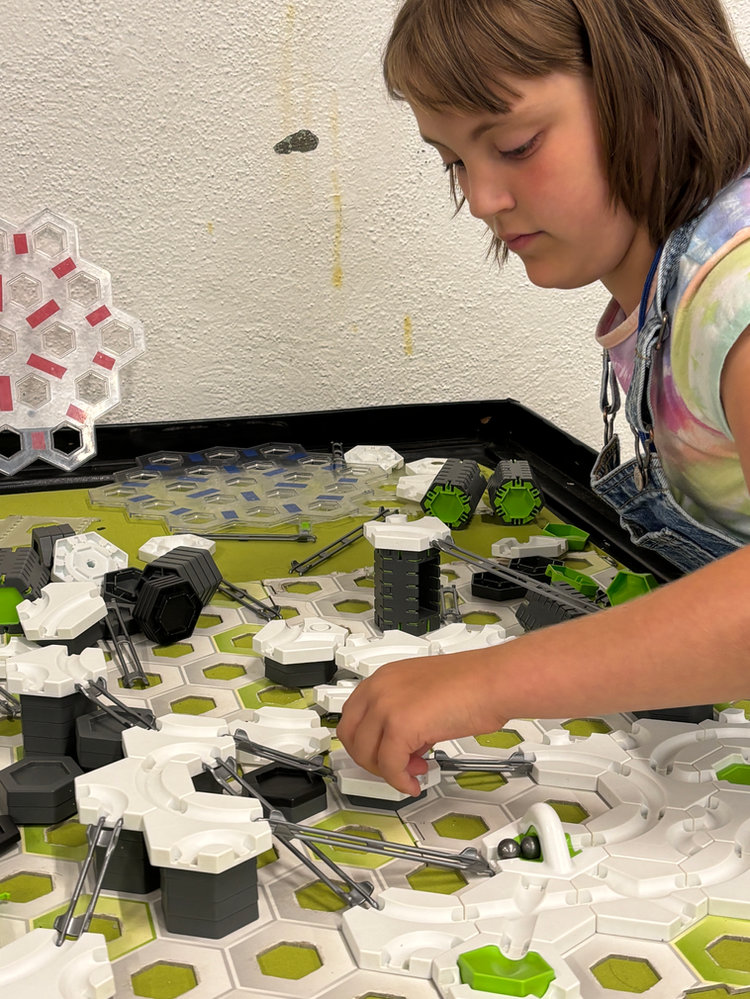
Happy Makers
Art classes, camps, and open studio for all ages.
Connect
Ask Mellow

Questions Happy Makers hasn’t answered online? Ask School’s Out’s assistant.
What they offer
3 activities · All ages
Suggested for you
No-School-Day Art Camp
Show details
- Ported from Last design’s business page (Hannah, October 1). The header is 308px tall, 30% under the Brand System’s 440px. Its photo is full bleed: it keeps its framing beside the panel and continues under it, and a blurred copy fills what the photo does not reach (useFullBleedPhoto). The panel follows Figma’s business card (Hannah, October 7, 2717:7019): the business’s logo sticker at the top (120px since October 12, Hannah; it peels and can be dragged anywhere on the hero card), with Follow (the bell and the word, then Following; October 20: the parent hears when the business adds an activity, posts new sessions, or opens registration) and Save (a bookmark) beside it, and the name with a short line that always fits two lines (heroLine, 54 characters or fewer, never cut off) at the foot, with Carousel dots that show each of its photos (up to five). No verified seal (October 7); the category tag was removed on October 1 and the rating on October 5 (Hannah: reviews are out of scope).
- Connect lists the business’s website, phone, and email, each hidden when missing; Save sits in the hero. The address row and its Google Maps link left on October 5 (Hannah), since a business can have several locations. Ask Mellow offers three questions businesses rarely answer online, each opening Mellow with the question drafted, unsent (askHref); the rows have no arrows (Hannah, October 7). What they offer shows the activity count, the ages served, and a small Secondary button per activity format and subject (activityHref; outline Chips until October 7). Suggested for you is the business’s first activity that fits one of the family’s children, shown as its title, its photo, and View activity, a Soft button (October 19: the page has no main action of its own, since booking happens on the activity page). With no activities it says Programs not posted yet, with Ask about programs.
- Fits any width (container queries): stacked on phones; from 576px the header across, then two cards to a row; from 880px, on the page’s own columns (October 15; eight tracks of its own before), the side (Connect over Suggested for you) takes a quarter of the columns and the hero the rest, and Ask Mellow and What they offer split the left side (see Layout grid).
- The four cards are four shades of the business’s primary color (October 5), in order: Suggested for you, Connect, What they offer, Ask Mellow.
- Not in use yet: on October 26 (Hannah) the business page became the business page test’s design (Option D with header F, PRODUCT.md), so no page uses this section.
Media hero
Not in use yetRetained for design review. No consumer screen uses this component.
The top of a business’s page: its photos, logo, and name on a glass card in the business’s colors.
Happy Makers
Art classes, camps, and open studio for all ages.
Show details
- One hero for the business page and the activity page (October 11; each drew its own); the Business page header used it until October 26, and since then no page does (Not in use yet). Stacked, the photo fills the top at 16:10 above the white glass panel; from 624px of the hero’s own width, the photo is full bleed beside the panel, keeping its framing and fading out under it over a blurred copy of itself.
- The panel holds the logo with small buttons at the top (on a business page, Follow and Save), and the title in Headline, one line under it in the lead type, and the photo dots at the foot. The brand stops at the card.
- The activity page used it from October 11 to 13; since October 14 it opens on its Title card instead (Hannah: a parent needs the content more than an image banner). An activity (Hannah, October 12) has no logo at the top: the photo dots take that corner beside Share and Save, its line is a summary of the activity, two lines at most, and under it, across the panel, who offers it, the business’s logo (64px) beside its name (Business byline), so the two read as one.
Title card
Not in use yetRetained for design review. No consumer screen uses this component.
A page’s title on the business’s own color, with no photo: what it is, who runs it, and the buttons for it.
Vivid, the activity page’s look, in the business’s own color
Open Studio
Hosted by Happy MakersThis business is verified by School’s OutIrvington
Vivid with no brand color yet: the off-white card with School’s Out’s colors along its top
Nature Explorers
Hosted by Cedar Hollow Day CampThis business is verified by School’s OutPortland
Card, the default
Open Studio
All ages$25 for one visit10 am–12 pm
Show details
- Hannah, October 14, after client feedback that a parent booking an activity needs the content more than an image banner: the activity page opens on this card. From October 19 (Hannah, after the client chose the activity test’s O) it wore the vivid look, beside the sessions column on web and first on a phone. Not in use yet since October 26, when the activity page became Getting there first, which leads with the activity’s own card.
- Vivid, the activity page’s look: the business’s own color as a slowly moving field, from the vivid palette the Brand System emits (see Vivid field), with the words in the ink the Brand System chose for it, so they stay readable. The activity page passes the activity’s categories and interests as Tags over the title, the title at the display size (48px), Hosted by the business with the Verified stamp and its neighborhood, and the logo sticker at its top left (172px, 116px on a card under 560px), which can be dragged anywhere on the page. Share and Save sit at its top right, with More (Report a problem).
- A business with no brand color yet (or a true gray) gets an off-white card with School’s Out’s colors along its top edge in place of the field (Accent edge, under Color and type; Hannah, October 19).
- Card, the default: the Brand System’s first card shade, the business card’s tile, so its ink, links, and buttons follow the card, with the facts as Tags. The activity page test’s direction D used it (October 22 and 23). At least 360px tall on web, 432px with the sticker on the page; on a phone its text sets its height.
Location
Not in use yetRetained for design review. No consumer screen uses this component.
Where a business is: its area, and a pin on a drawn map for each location. Tap a pin for its details.
Wide
Location
Portland, Oregon
3 locations
Sample business
Irvington, Portland
18 min drive from home
Sample business
Buckman, Portland
12 min drive from home
Sample business
Downtown, Portland
20 min drive from home
Labels you can choose: one shows only its activities, and choosing it again shows them all (the business page test)
Narrow
Location
Portland, Oregon
1 location · 18 min drive from home
Sample business
Irvington, Portland
18 min drive from home
Show details
- From Figma’s business page (2651:2045 on web, 2653:10865 on a phone, October 7). A business can have several locations, so the map pins each one and a pin opens its name, area, and one more line (Figma’s annotation). No street address and no Get directions (Hannah, October 5 and 7).
- The map is drawn, not a real map: a river, parks, and streets mixed from the page’s surface, ink, and accents, so it follows light and dark. Pins are placed by position (0 to 100 across and down); a real map would come from the API.
- The details beside the map from 640px of the card’s own width, above it below that.
- Not in use yet since October 26 (Hannah): the business page’s Locations is a street map with a pin per place (StreetMap). LocationMap still draws the Commute map’s drawn map.
Commute map
Where an activity is, and a route through your places to it: each leg’s time and the total, with a time if you want one.
S.T.E.A.M. Discovery Camp
1421 SE Stark St, Portland, OR 97214
- Stop 1: Home1824 SE Lambert St8:47 am
- Stop 2: S.T.E.A.M. Discovery Camp1421 SE Stark St, 13 min drive from Home, 4.3 mi9 am
When you want to get to your last stop.
Show details
- For an activity’s page (Hannah, October 8, after Airbnb’s listing map): an activity happens in one place, so it shows its street address with Open in Maps. A business page never does, since a business can have several locations.
- Since October 21 (Hannah, after Google Maps’ and Apple Maps’ stops) it is a route the parent arranges: it starts as Home, then the activity. Add a stop suggests the family’s places first (Home, a child’s school, Work) and finds addresses as the parent types; a tap on a place on the map, or on the ground to drop a pin, adds one too. A handle drags a stop to a new place in the order, and × removes one, with Undo; the activity always stays. Up to 5 stops.
- Each leg shows its time and distance, and the foot the total, by Drive, Transit, Bike, or Walk, always “About”. The map draws the route with numbered stops and each leg’s time. Get directions opens the stops in Google Maps.
- The time starts as Arrive by the session’s start, and the parent can change it or clear it: Arrive by is when they want to reach the last stop, Leave by when they leave the first. The session’s start and end are labeled in the list of times. With a time, each stop shows when they’d be there. There is no drop-off or pickup.
- A place that isn’t saved is recognized by what it is and offered to save: a school to a child’s profile, a workplace as Work, a home as Home, anything else as a place. Nothing saves until the parent says so, and every save has Undo.
- Since October 15 (Hannah, after Airbnb’s Where you’ll be): the area in a line over the street address, then the map, 240px tall on a phone and growing with the column to 440px, with Full map and zoom in and out on its top right. The activity is marked by the business’s round logo on a soft circle. From 720px of its own width the stops sit on the left and the map on the right; Full map shows the stops beside the map, or under it on a phone.
- An activity with no street address has no Location section (Hannah, October 21).
Sessions
Not in use yetRetained for design review. No consumer screen uses this component.
Each session is a pill. Tap one to open its details and book. These live on the activity page; a business’s page shows its activities, not sessions.
No-School-Day Art Camp
No-School-Day Art Camp
No-School-Day Art Camp
Creative Studio Classes
Creative Studio Classes
Open Studio
Show details
- The pill’s circle takes the activity’s accent color.
- The card grows out of the pill and shrinks back on close.
Finding an activity
Not in use yetRetained for design review. No consumer screen uses this component.
A page for a parent comparing activities: filter by age, switch formats, search, and sort the results. Each row opens the business.
Activities in Portland
Show details
- What each row shows follows the earlier schoolsoutapp.com search and activity pages (Hannah, October 1): the activity and its business, schedule, ages, next session, price, and session count, with Save for the earlier Add to collection. Every business’s real listing, gaps included. Open spots only keeps activities whose next session is open.
- The table structure came from the Sweatpals host dashboard; the content is for families, not providers.