
Components
Cards and layout
Cards, tables, and ways to show more.
Collection card
A curated collection as a branded cover with its name on it; a family’s own as its name, maker, and count beside a few of its photos.
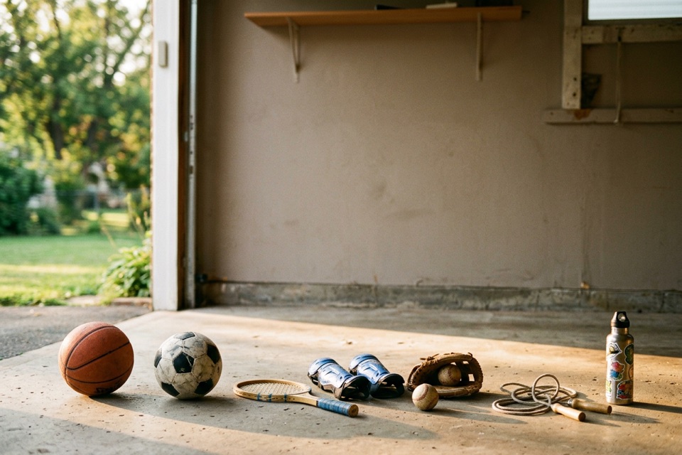
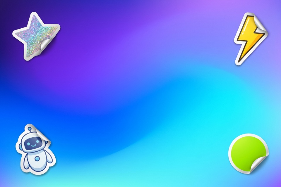
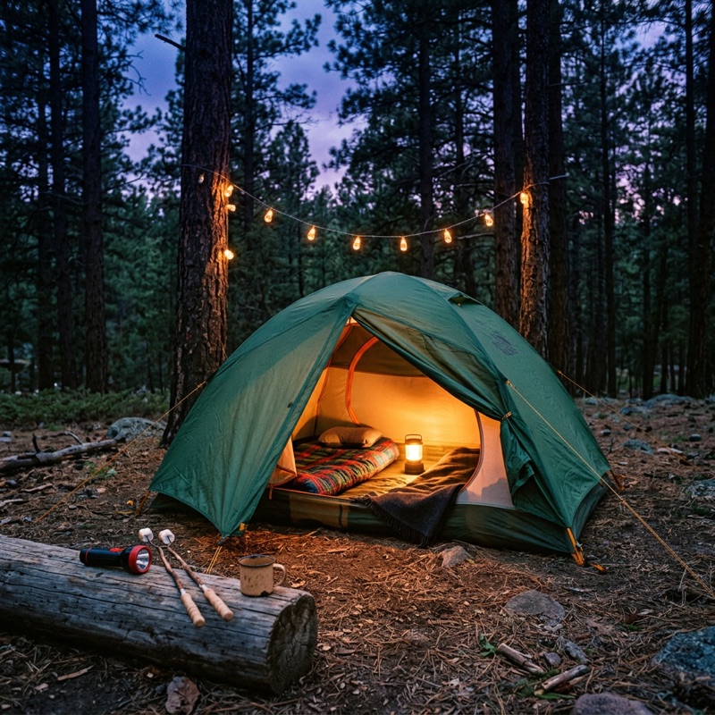
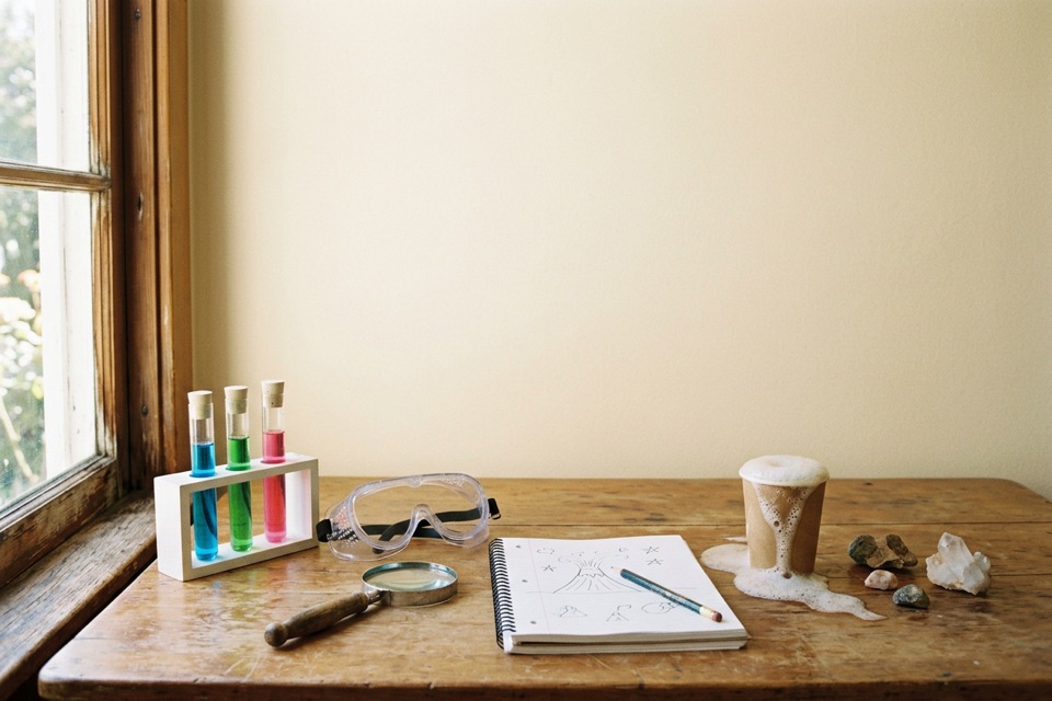
Covers: still life, gradient, taped print, and a business’s collection
Rows, for a family’s own collections



On a profile, without counts
Show details
- Covers (Hannah, October 14): a curated collection, School’s Out’s or a business’s, is a 3:2 cover in the brand (4:5 until October 28, when Explore’s covers grew to two tiles wide), after its posts, since curated collections are how School’s Out features things. Each cover is a generated image with no text, and the name is set on it in heavy uppercase (ExtraBold, --schools-out-font-weight-heavy, the one rule that reads it directly, since the name sizes itself to fit rather than taking a step), sized to fill its space without breaking a word, three lines at most. Three styles take turns down Explore’s shelf so no two neighbors match: a sunlit still life with the name on a torn paper label and hand-drawn rays; a gradient with stickers and the name in big white type; and a photo taped as a print to an accent (purple, turquoise, orange, or blue) among white and yellow doodles, with the name as its caption. A business’s collection names the business in a pill at the cover’s top left, with its round logo. Only the name is on the cover otherwise: no maker, no count.
- The covers’ images are in public/collections, generated in Figma from the brand’s posts (sunlit candid still lifes, vivid gradients with stickers, taped prints with doodles), each its own scene, light, and palette. The print, tape, doodles, and accent of a taped print are drawn in code, so the caption always lands on the print. A collection a family makes has no cover and keeps the row below.
- The row (Hannah, October 8), after a reference of list cards that fan their products: the name, who made it, and the count on the left, and up to three of the collection’s photos on the right as small photo cards, tilted and overlapping like prints dropped on a table, cut off by the card’s bottom edge. The cover lies on top. On hover the photos spread a little; reduced motion keeps them still.
- The card is at least 144px tall. The name is the lead size in Medium in up to two lines; who made it (the seal after a verified business) is body in the muted ink, and the count sits at the foot. Photo cards are 80 by 100px with a 3px print edge and the raised shadow. Under 400px wide the photos shrink to 84%.
- Explore features only collections School’s Out and businesses make, as covers in a shelf (October 14; rows in columns of 400px or wider before). Families make collections too; theirs stay on the Collections tab as rows.
- Since October 9 (Hannah, Collections) a family collects businesses too, so the count reads “3 activities · 1 business”, and an empty one reads “Nothing yet”. A family’s own collections say Private or Public with a lock or a globe; a parent who made one shows their photo, or an initial, before their name.
Card
Not in use yetRetained for design review. No consumer screen uses this component.
A card with a title and a line of detail. With a link, the whole card is clickable.
Pickup and drop-offDoors open at 8:45 am. Pickup ends at 3:15 pm.
Payment and refundsFull refund up to 7 days before the session.CompactFor dense lists.
Show details
- From Reyn’s list, in Panel’s material since October 9: the container color with no hairline, lifting onto the raised shadow on hover when it is a link. For a plain container that holds anything, use Panel.
Panel
The plain container: a flat surface for grouped content that is neither a business’s brand nor text on a photo, like a business’s overview or a settings group.
Pickup and drop-offDoors open at 8:45 am. Pickup ends at 3:15 pm.
Payment and refundsFull refund up to 7 days before the session.
What to bringLunch, a water bottle, and clothes that can get messy.
Plan your weekA soft wash shows through the rim glass.
Summer possibilitiesThe footer’s tint, lit edge, depth, and blur, shared by editorial cards.
Things to knowBring a lunch and a water bottle.
Use liquid for the directory footer’s material without adding raised. It shares LiquidGlassMaterial.module.css with DirectoryFooter, follows the appearance, becomes opaque under reduced transparency, and gains a strong edge with more contrast. The default and frosted materials are unchanged.
Show details
- Hannah, October 5: the plain container is the neutral card Last design used before Paper (October 1), without the glass gradient it wore, so Paper and its torn edges are gone. It follows light and dark.
- One look (Hannah, October 8): the surface at half over the page, with no hairline, and the container radius (24px). It was the feed’s quiet Panel; the full surface with a hairline read too dark and was removed. A container a screen draws itself uses the same color.
- Padding is 24px (16px on a phone, decision D2, October 11), or 16px compact. A Panel at rest on the page is flat (decision D4, October 11): raised adds the card elevation only for a container over another surface, such as the focus card over the ambient glow, or a card over a photo or a map. Brand cards and photo cards stay glass.
- It fills the width it is given; the content inside sets its height. With more contrast asked for, a hairline appears.
- Open (October 18): no fill, edge, shadow, or padding, so a group sits straight on the page or inside a glass card; open groups one after another are parted by a hairline and the section gap. The activity page’s About this activity, Location, Things to know, and Photos are open Panels in the rim glass (Glass card).
- Liquid (October 22, from the summer marketing page): the directory footer’s glass, for editorial cards over an accent field, such as the summer marketing preview’s benefits. It brings its own depth, rim, and shadow, so it needs no raised.
- Light (Hannah, October 27, for the brand pages’ cards over strong color): liquid glass without the streaks of light it draws across a small control, which on a card read as a fixed white band, catching the pointer’s light instead, as a Glass card does: its rim brightest where it faces the pointer, a softer counter-light opposite, a faint band of reflection and a glow passing through the pointer, and a glint along the bottom edge, gliding after the cursor. Only under a mouse; the glass alone otherwise.
Brand wash
Not in use yetRetained for design review. No consumer screen uses this component.
A business’s color behind a page: fading from the top, or a soft tint.
Soft fade with drift, as on the activity page test
Fade, not in use yet
Tint, not in use yet
Show details
- Hannah, October 15, after the client found the activity page washed out: the activity test’s B (fade, after Spotify’s album color), C (tint, after Partiful’s themes), and D (soft fade). It paints the brand card’s material, so it never holds a brand color itself.
- Not in use yet: the soft fade with drift was behind direction D on the activity page test (Hannah, October 22 and 23), which left the test on October 23; fade and tint were never placed on a page.
- Content on it sits on solid or frosted cards (Panel solid or frosted, raised), so it reads; direction D uses frosted. The host wraps the whole page, back link included; the wash reaches the edges of the page’s scroll area.
Divider
A hairline across its container, with a word in the middle when it parts two ways in.
Show details
- October 26, from the sign-in screens’ “or”: the border role’s hairline, the word in the small type and the muted ink. Use the section gap, not a divider, between sections; a divider parts two choices or two groups that sit close.
- November 1, for Explore’s registration filters: vertical, a short upright rule between two groups of controls in a row (the status chips, then the other filters), 24px tall, as a line of text is.
Glass card
Glass for a business’s cards and the activity page’s sections, and a white panel for text on a photo. Move the pointer across a card to see the light follow.
Things to know
Bring a lunch and a water bottle. Full refund up to 7 days before the session.
White panel, for text on a photo
Show details
- The finish (Hannah, October 11: the border read too thick and the reflections too intense) has six settings (--schools-out-glass-*, from Tokens Studio in packages/tokens/schools-out.css): a 1px rim (1.25px before) at 20% brightness, the brand card’s outline at 50%, the white wash at 100%, the shine that follows the cursor at 40%, and the shading inside the edge at 45% (all 100% before; Hannah’s values).
- Rim (Hannah, October 19, after Linearity’s glass cards): a 1px rim whose light faces the pointer while it is over the card and rests at the top left, a faint inner glow, and a 1.5px halo, over a frosted fill the host gives it. The activity page’s sessions, About this activity, Location, Things to know, and Photos sit in it on the white page.
- GlassPanel is the white panel for text on a photo, at 70% white with a 16px blur (October 1, from Last design; 50% and 8px before), so dark text reads at 8.7:1 even over black. The business page’s hero and the log in screen’s photo use it.
- An activity’s card is Activity tile. Its words have sat under the photo since October 14 (Hannah), so it has no glass.
Brand card
A card painted in a business’s brand colors. Readability shows how easily its text reads: we aim for 8.2:1, and 4.5:1 is the minimum.
A business with its own colors: Happy Makers
Suggested for youReadability 7.4:1
ConnectReadability 7.4:1
What they offerReadability 7.3:1
A business with no colors yet: Sample: Cedar Hollow Day Camp
Suggested for youReadability 6.9:1
ConnectReadability 6.9:1
What they offerReadability 7.0:1
Show details
- Every brand card is a shade of the business’s primary color (Hannah, October 5: One brand color per card was removed), so a business’s cards read as one family. Since October 19 (Hannah, the vivid finish) each keeps the brand’s own hue exactly and pairs with the hues beside it, near and far by turns, in place of another color family. A business with no colors yet gets shades of a quiet blue-gray.
- When its text is light, its glass dims (lightText). Hover lifts it 2px; reduced motion keeps it still.
Logo tile
A business’s logo on the background it was made for, or its initials when it has no logo.




Initials

Show details
- Wide wordmarks get a wider plate. 80px in the business page header (plates up to 240px; 56px for part of October 1, then 80px again at Hannah’s request), 56px in lists (plates up to 168px), 64px in the overview, 48px in an Offered by row (card), 40px beside a post or a message, where a person’s avatar would sit (avatar), 28px in Business byline’s pill (byline; October 11, when a small activity tile’s byline used it too, until October 20), and 20px inside a line of text where a business is mentioned, before its name in the link blue (mention; Hannah, October 7, after Bluesky; wide plates up to 48px).
- Round (Hannah, October 11): a circle, with a logo inside it on its own ground, a wordmark included, so nothing is cut at the corners, and initials on the brand color. Business byline and the activity’s marker on its map use it.
Logo sticker
A business’s logo as a die-cut sticker, so any logo looks placed on the business’s colors. On its business page and its activities’ pages it peels and can be dragged around.
Every business in the catalog: cut to its own shape, on a backing shape in its own ground, or its initials
The six shapes: four for compact logos and initials, two for wordmarks
Peel on: hover to peel, press and drag to move it around the card
Wear: each move wears the corner it’s handled by a little further (a deepening crease, a frayed edge, print rubbed through), through five stages from new to worn; it never comes off
Show details
- Hannah, October 8: the logos the platform finds come in every kind (transparent, on a white box, on a colored square, wide wordmarks, none), so a hand-made artwork tile can’t be made from them. A sticker can: a logo with a distinct shape of its own is cut along it, with its own ground just around it and a white edge; any other logo sits on a backing shape filled with its own ground, so a square logo’s background disappears into the shape; a business without a logo gets its initials on one in its brand color.
- Six backing shapes, clean and a little playful: scalloped, starburst, flower, and squircle for compact logos and initials; a pill and a wavy pill for wordmarks, so they never shrink inside a circle. A business keeps its shape and its tilt (2 to 6 degrees either way) on every page and every visit. The shadow follows the die cut.
- Texture (Hannah, October 16): every sticker reads as vinyl, a fine tooth and a faint mottle over the whole face, white edge included, and a soft gloss along its edge, never grungy. Since October 18 it also has one soft crease, at an angle its own to each business, soft shading from the top left, after real paper stickers, and a plastic sheen (a broad band of light across its top left and a thin glint after it); never warped, and torn only slightly, at the corner a parent has moved it by (Wear). As it peels and lifts its shadow keeps soft edges (it had been cut off in a straight line at the fold), and the curled flap casts its own shadow on the sticker under it.
- Peel (after scalar.com’s stickers): hovering curls the top edge back to show the sticker’s paper back (since October 23, Hannah, along a fold tilted 20 degrees, so the top-left corner lifts most), pressing lifts it further, and it can be dragged anywhere on its card; letting go presses it down with a small bounce where it was dropped. On for the business page’s top section and the activity page’s title card. On an activity tile it peels but can’t be dragged (Hannah, October 20), since a tap opens the business’s page. Off on Explore’s business cards. Reduced motion keeps it flat and in place.
- Wear (Hannah, October 22 and 23): a sticker that can be dragged wears like a real one peeled up and pressed down again, all where it peels on hover, the top-left corner, since that’s the part that’s handled. Since October 26 (Hannah) it never comes off: it wears through five stages, new to worn, and stays at the last however often it’s moved (until then, letting go after the third move peeled it off and it dropped away until the page was left). Each move somewhere new wears that corner further, fading out from it: one crease along the fold, deepening (a fresh crease a move stacked into steps, as if the sticker fanned toward you, Hannah), an edge that frays into small nicks and tears, the print rubbed through to the white from the edge inward in fine specks, and, from the second move, a little grime along the edge. The corner rests a little lifted, showing the paper back (3% of its height, then 5%, 6.5%, and 8%; a wide sticker measured at its end, so it lifts as a square one does), and hovering still peels it further. A tap that doesn’t move it doesn’t count. Activity tiles’ stickers can’t be dragged, so they never wear. (On October 22 the wear curled a separate bottom corner; Hannah: the edge that’s peeled is the one that wears.)
- Sharper (the same day): the logo is read at the size it’s drawn in the screen’s pixels, so a large sticker’s die-cut edge is never stretched; the cut has a hairline of shade along its bottom right, the vinyl’s thickness; every crease has a fine fold line at its middle; and a dragged sticker lands on whole pixels.
Business card
A business on Explore and in Collections: its logo centered on a tile in the business’s color, with its name below.
Four businesses: its own colors (with a bookmark), a wordmark, initials, and no colors yet
Name inside, an option no screen uses yet
Show details
- From Figma (2564-9213, October 5): a tile at 231 by 207 (the ratio holds at any width) on the card radius, the logo centered, then 12px down to the name. Figma’s lime and SF Pro come from the library instead: the tile is the business’s first brand card, a shade of its primary color from the Brand System, and the name is body text in Medium.
- Since October 8 (Hannah) the logo is a sticker with no peel (Logo sticker), 136px since October 20 (Hannah: 15% larger than the 120px before): cut to its own shape or set on a backing shape in its own ground, so it reads on any shade; a wordmark gets a wide shape no wider than the tile; a business without a logo shows its initials on one. A business with no colors yet takes one of School’s Out’s accents for its tile, picked from its name so it keeps it on every shelf, fading from the accent to a lighter one of the same hue, and keeps its initials on a pale blue-gray (Hannah, October 27: a shelf of them read as a row of gray tiles; the tile was the blue-gray too before, and the initials a darker one). The Explore frame’s hand-made artwork tiles were removed the same day: the Brand System can’t make them from the logos it is given.
- The name is one line, cut with an ellipsis as Figma shows; the full name is in the link and its tooltip. Hover lifts the tile 2px; keyboard focus rings it. Give it at least 160px; in a grid, a column each.
- With saved and onSave (Hannah, October 9) the tile carries a bookmark on its top right corner, so a family can save a business to Collections. Since October 20 (Hannah) it is the activity tile’s bookmark (a black tint inside a white outline, solid white once saved, the icon 12px in; a glass circle before), so a grid that mixes businesses and activities shows one bookmark. It lifts with the tile.
- Name inside (Hannah, October 13, for Collections, where businesses and activity tiles share one grid): the tile is square and holds everything, with the name in a 32px pill 12px inside its foot, in the bookmark’s glass (Icon button’s secondary), so the card reads as one tile beside them. The logo centers above the pill; in a tile under 240px it draws at three quarters so it clears it. No screen uses it since October 14, when activity tiles moved their words under the photo and Collections went back to the name below.
Activity tile
Every activity, on every screen: what it is, who runs it, when it is, and what it costs, under its photo.
Small, medium, and large
No-School-Day Art Camp
Happy MakersFri, Oct 9, Ages 6–10$95 for the dayS.T.E.A.M. Discovery Camp
Experiment PDXFri, Oct 9, Ages 6–10$95 for the dayOutdoor Adventures
Trackers EarthFri, Oct 9$95 for the dayEvery kind of date and price: a day, a weekly class, a drop-in, a week, and a series with no dates listed
S.T.E.A.M. Discovery Camp
Experiment PDXFri, Oct 9, Ages 6–10$95 for the dayCreative Studio Classes
Happy MakersSat, Oct 3–24, Ages 5–9$145 for 4 classesOpen Studio
Happy MakersSat, Oct 10, All ages$25 for one visit
Japanese Folktales
Kurabu $260 for the week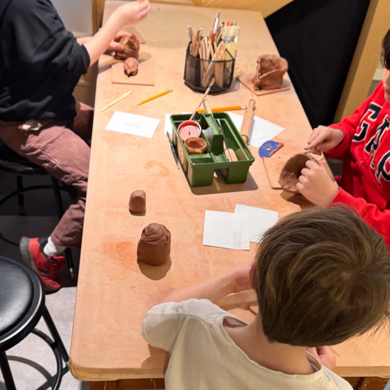
Kids Ceramics
Studio EmrysAges 7–12$275 for 6 weeksA long title, cut to one line; a business with no photo or logo; a price the data doesn’t have; and every date full, with no waitlist and with one

Circus Theater Camp: tumbling, juggling, and a show for families on Friday
Echo Theater CompanyFri, Oct 9, Ages 6–12$90 for the dayRobot Builders
Bright Ridge RoboticsFri, Oct 9, Ages 8–12$110 for the dayCode Lab
Sample: Bright Ridge RoboticsWed, Nov 11, Ages 8–12FullJunior Makers
Sample: Bright Ridge RoboticsWed, Nov 11, Ages 6–9$95 for the day, FullIn Explore’s results, for Maya and Theo
S.T.E.A.M. Discovery Camp
Experiment PDXFri, Oct 9, Ages 6–10$95 for the day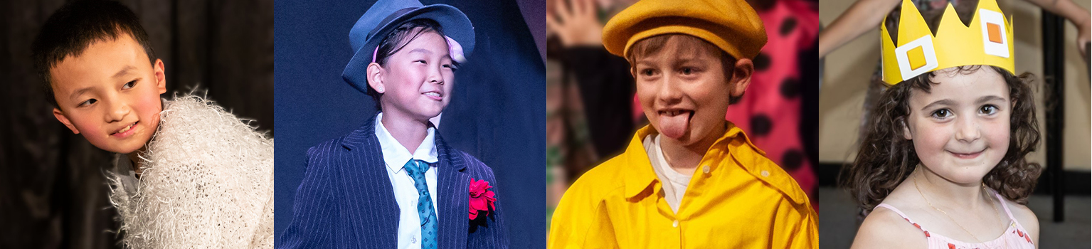
First Stage
Northwest Children’s TheaterFri, Oct 9, Ages 4–6$60 for the dayCreative Studio Classes
Happy MakersSat, Oct 3–24, Ages 5–9$145 for 4 classesIn Explore’s results for Friday, October 16: the date is the session on that day
S.T.E.A.M. Discovery Camp
Experiment PDXFri, Oct 16, Ages 6–10$95 for the dayNo-School-Day Art Camp
Happy MakersFri, Oct 16, Ages 6–10$95 for the dayKids Ceramics
Studio EmrysAges 7–12$275 for 6 weeksWith friends going: one, two, and three or more, in the photo’s corner ahead of any tag
No-School-Day Art Camp
Happy MakersFri, Oct 9, Ages 6–10$95 for the dayS.T.E.A.M. Discovery Camp
Experiment PDXFri, Oct 9, Ages 6–10$95 for the dayFirst Stage
Northwest Children’s TheaterFri, Oct 9, Ages 4–6$60 for the day
On a business’s own page: where it meets in place of the business, and no sticker, four to a row
As a row, beside Explore’s map: the same four lines beside the photo, the bookmark on the title’s line, the tag (or friends going) under the price, no sticker
S.T.E.A.M. Discovery Camp
Experiment PDXFri, Oct 9, Ages 6–10$95 for the dayRobot Builders
Bright Ridge RoboticsFri, Oct 9, Ages 8–12$110 for the dayBasecamp
Trackers EarthSat, Oct 3–24$85 for the dayLoading: the tile’s own shape, so the grid holds its layout (ActivityTileLoading)
Show details
- The one activity card (Hannah, October 8): Explore, Collections, and a business’s Current activities show activities this way. It replaced Listing card, Activity card, and Explore’s photo fade, and our own decisions win over Figma’s frames. A list of activities uses Listing row instead.
- What it answers (Hannah, October 11, after a review with Elyse, Elijah, and Rishav found the card didn’t help a parent decide whether to open it): what it is, who runs it, and when, then what one booking costs. Dates were missing on time-bound activities, the logo was too small to build trust, and every line looked the same.
- The photo is the tile, and the words sit under it on the page (Hannah, October 14), as the business card’s name does. From October 11 they sat on a white glass panel 4px inside the photo; its 70% wash took on each photo’s color, so tiles didn’t read as one set, and it covered much of the picture. The photo sits in the photo frame on the container radius (a hairline drawn over it, so a pale photo keeps its edge on the page), square on small and medium tiles and 5:4 on large, and fades in once it loads.
- The layout (Hannah, October 20, after Airbnb’s listing card): the photo holds three things, each 12px in from its edges (16px on large; 8px before, which read tight): one thing on its top left (friends going, else a tag), the bookmark on its top right, and the business’s logo sticker on its bottom left, where Airbnb puts the host. Under the photo, on its left edge and set close, four lines on every tile, so tiles in a shelf end together (Hannah, the same day: four to six lines read long): the title 8px down, the business, when and who on one line (“Fri, Oct 16 · Ages 6–10”), and cost. Before October 20 the business signed the tile at its foot beside its 20px round logo (28, 40, and 48px by size from October 11 to 14).
- The sticker (Hannah, October 20: the business’s brand should show on every activity) is the business’s logo sticker, 35% of the photo’s width (Airbnb’s book is about 24%; Hannah asked for 15% larger on October 20, then 25% larger again on November 1: 52px on a phone’s 152px tile, 84px on the web’s 246px tile, about 124px on a large one), in the shape and tilt it has everywhere. It peels on hover but can’t be dragged, and it opens the business’s page, as the business’s name under the title does; the rest of the tile opens the activity. On the business’s own page neither links, since both would open that page.
- Type (Hannah, October 14): the title in the body size (16/24) in Medium, on one line with an ellipsis so the details line up across a shelf (two lines until later the same day). Under the photo the 18/24 tile title, sized to lead a panel over it (October 11), outweighed the photo, and the step was removed. Everything under it is the small type (14/20) in the muted ink (Hannah, October 20, on every tile, so the date and ages fit on a phone’s tile; the body size before), each detail on its own line but when and who, which share one (Hannah: plain text, not tags), with the price’s amount in the ink in Medium so it stands out (“$95” strong, “for the day” quiet). The business’s name underlines in the ink under a pointer.
- The details, in the same order on every tile (Hannah, October 11, after a review of the real data): every activity fills the same buckets, and only the words change with its type. When and who share a line, the date first, with a dot between them (Hannah, October 20, the one dot on the tile, reversing October 11’s no dots for this line): “Fri, Oct 16 · Ages 6–10”, or the date alone when the data has no ages. When (Hannah, October 20, for the client: on every tile, reversing October 11’s dates only once the parent filters by Dates): the next session only, “Fri, Oct 16”, “Jun 15–19”, or a weekly class’s whole run, “Sat, Oct 3–24” (shortened from “Saturdays” to fit beside the ages), since one booking covers it; once the parent filters by Dates, the next session on those dates; with none ahead, nothing (Hannah, October 20: Dates on their site didn’t help), so the line holds the ages alone, or stays empty to keep the four lines. Cost: “$95 for the day”, “$450 for 5 days”, “$145 for 4 classes”, “Free”, or a blank line when no price was found (Hannah, October 29). Hours, where, and extras stay on the activity page or show as a photo tag once the parent filters on them.
- Price says what one booking costs and what it covers, because the real data has one price per session and no period. $0 is free and reads Free with no covers; a price not found on the business’s page leaves the line blank. “From” leads when sessions cost different amounts.
- The photo’s top left holds one thing (Hannah, October 11: whatever matters most takes over), as Airbnb’s Guest favorite sits: friends going first (Hannah, October 20), then a status with a library icon in the tag’s ink (Opens Feb 1, Join waitlist, or how many spots are left once 5 or fewer are: “3 spots left”, “1 spot left”; Hannah, October 20, in place of Last spots, which didn’t say how few, and of the toasts’ status marks, whose navy outline read heavy on a photo), else what the parent filtered on that the tile doesn’t already say (“4.2 mi away”, “Fits Maya”). It takes the library Tag’s shape (24px, 8px corners; round reads as tappable here) on the photo’s white material, on the bookmark’s center line; every one the tile could show is still read in the link’s label.
- A full date (Hannah, November 2): the tile shows the first date a parent can still book, so a full next date no longer marks an activity with open dates after it as full. Only when every date is full does the tile say so, and only where it still shows (a search, a business’s page, Collections; Explore’s browsing leaves it out): Full beside the price (“$95 for the day · Full”, as the activity page’s session rows say it), and Join waitlist with the bell as the tag when the business keeps a waitlist, since that is what the parent can do. The tag is a label: the tile opens the activity, where the parent joins. A Full tag on the photo read as the whole activity being over, and a Waitlist open badge didn’t say what to do.
- The real data has no count of spots yet, so a live session marked last spots shows no tag; the sample gives each date it marks Last spots a count of 1 to 5, the same one the activity page shows. The bookmark (Hannah, October 20, after Airbnb’s heart) is a bare icon on the photo’s top right with a soft shadow: a black tint inside a white outline (1.25px, 1.5px on large, at Airbnb’s proportion; the icon’s own 1.67px outline read too thick) until the activity is saved to Collections, then solid white, so it reads on any photo in either appearance (white outline alone from October 14). It keeps the plain icon button’s 40px box (48px on large), centered on the icon, and its soft square on hover, but not the square a pressed toggle draws. No rating (October 5).
- Friends going (Hannah, October 11; bare on the photo’s top left like the bookmark since October 14; ahead of any tag since October 20, after a turn under the photo the same day, since faces on the title line would have cut titles short): up to three 20px faces, overlapping, each in a 1px white ring, then their first names and going (“Priya going”, “Priya and Ana going”, “Priya and 2 friends going”) in white with a soft shadow, over a faint shade across the photo’s top that shows only with them. The names shorten before going, and on a tile under 200px (a phone’s shelf) the faces and going show alone; the link’s label still reads the names. Only friends who share plans with friends, the rule their profile follows; never a child’s name or photo on a tile.
- Overlay (an exploration, October 11, after a featured card Hannah shared: the photo filling the tile under a shade, with the words on it in white) was removed on October 14 with the panel, since the words now sit under the photo.
- Every line keeps to one line with an ellipsis, the title included (Hannah, October 14); the link and its tooltip carry the full title.
- As a row (October 27, Explore’s map, where the list sits beside the map and needed more activities in view than tiles allow): the same four lines beside an 88px square photo (72px under 360px of the row), and what the tile lays over its photo on the page instead. Since October 30 (Hannah) the bookmark sits at the row’s end in the ink, its icon on the title’s line, and the tag (in the fill) or friends going (faces, names, and going) is a fifth line under the price, so the details run to the row’s end under the bookmark; a row with a tag is a line taller. Before, the tag sat at the row’s end over the bookmark, and friends going showed only faces and going. No sticker: the business’s name says who. A row answers a pointer with the fill rather than a lift, and keyboard focus rings the whole row.
- Small is for browsing many at once, as Explore does (152px and up): two columns of the fluid grid on the web (246px at 1440 and 1728 with October 23’s 40px gutters; 212px with October 21’s 24px, 264px before), and about 152px in a phone’s shelf (Hannah, October 14: two tiles and part of a third, so a shelf shows more than one activity). Medium is for most grids (240px and up). Large, 5:4 with a 24px bookmark and 16px insets, is for a featured activity (360px and up).
- The photo and what sits on it lift 2px on hover, and the photo shrinks to 99% when pressed, as the business card’s tile does; keyboard focus rings the photo. With no photo, or one that fails to load, a placeholder shows; the consumer’s listings show their business’s photo instead (ListingTile).
Listing row
An activity as one row, for scanning a long list or attaching to a post.
Science and art · Day camp
S.T.E.A.M. Discovery Camp
Experiment PDX, BuckmanAges 6–10 · School holidays · 9 am – 3 pm$95 / day
Museum Day Camps
OMSI, Central Eastside$105 / day
- Trackers Earth, Brooklyn$85 / day
- OMSI, Central Eastside$105 / day
- Northwest Children’s Theater, Downtown$60 / day
Loading (ListingRowLoading)
Show details
- After Figma’s Explore map list (2540-16044, October 7): a 56px photo with 8px corners, the name and price in the body size, the business and place in the small size. Figma’s 16px bold maps to the body size in Medium (the title weight for the name and the label weight for the price; weights by role, October 19), its 12px to small.
- Each row sits in its own Panel, the subtle plain container, and rows are spaced 12px apart with no rules between them (Hannah, October 7). A row that opens something lifts 2px on hover, as clickable cards do.
- Below 360px the price sits under the name; wider, it takes a right-aligned column, as in the map view’s 488px list.
- No rating, though the frame shows one (Hannah, October 5 and 7).
List row
One row of a list: settings, people, and plans.
Settings rows on Panel, the tint reaching its edges
People, and a plan
- Booked
- Compact, 44px
- Default, 56px
- Comfortable, 72px
Show details
- One row for every list (October 11; settings rows, people rows, and plan rows each drew their own): a lead cell (an icon, a 40px tile or avatar, or a 56px photo), the text (an eyebrow, the title in Medium, muted details, a note), a tag beside the title once the row is 480px wide, a value, and controls at the end.
- A row that opens something is one target with a chevron, tinting under a pointer and a step darker while pressed; its controls stay their own targets. List draws the hairlines between rows from where the text starts.
- Three heights: compact 44px, default 56px, comfortable 72px.
Session list
The dates of an activity, each a way to book it.
- Fri, Oct 9, 9 am–3 pm, $95 for the day, OpenMaya is booked at Happy Makers that day.
- Fri, Oct 16, 9 am–3 pm, $95 for the day, 3 spots leftPriya’s kid is going
- Wed, Nov 11, 9 am–3 pm, $95 for the day, Full
- Wed, Nov 25, 9 am–3 pm, $95 for the day, WaitlistJoin their waitlist
- Saturdays, Oct 17–Nov 21, 10 am–11 am, $95 for the monthBook on their site
No sessions posted yet
As on the activity page: a calendar page on each date, black Book buttons, five, then See all
- Saturdays, Oct 3–2410 am–12 pm, $145 for 4 classes, OpenOne booking covers every class.
- Saturdays, Nov 7–2810 am–12 pm, $145 for 4 classes, 2 spots leftOne booking covers every class.Ana’s kid is going
- Saturdays, Dec 5–1910 am–12 pm, $110 for 3 classesOne booking covers every class.
- Saturdays, Jan 9–3010 am–12 pm, $145 for 4 classes
- Saturdays, Feb 6–2710 am–12 pm, $145 for 4 classes
Show details
- Every date that can be booked has a Book button (Hannah, October 12, after Tock’s reservation times): with only a chevron, a date read as “more about this date”. The whole date opens it too. It opens the booking module. On the activity page the button is the black Primary (Hannah, October 18: the dates didn’t call to be booked), as every booking action is; Soft is the default.
- Each date is the date, the time, and the price with what it covers on one line (“$95 for the day”), then the button. Under them, on a line of its own, one note when the parent should know something before booking (a day a child is already booked, in the warning tone; a series booked whole) and the friends whose kids are going that day.
- After the price, how much room is left: Open, or how many once 5 or fewer are (“3 spots left”, in the warning tone); never a count above that, and never Last spots (PRODUCT.md, October 21).
- A date that can’t be booked keeps its price and says why after it, Full or Waitlist (Hannah, November 2: a parent waiting for a spot still wants the cost; until then the word replaced the price). It ends in what the parent can still do: Join their waitlist on the business’s site when it keeps one, else its alert, Notify me (Tell me if a spot opens: PRODUCT.md, October 20; shortened November 2, as Explore’s registration list says it). A date not open yet says when it opens, with Remind me.
- An activity we can’t book for the parent keeps its dates; each says Book on their site and opens the business’s site in a new tab.
- On the activity page (Hannah, October 16, from the phone sketch) the dates are a list at every count, straight on the Sessions card with a hairline between them: the date, the time, and the price on one line where there is room (two on a phone), and Book alone at the end. Since October 19 (Hannah) each date leads with a small calendar page, five show, and See all N sessions opens every one in a sheet with filters, in the same rows; when every date costs the same, the price shows above the list and leaves the rows. Before October 16, each date was a card.
- Friends show only when they share their plans with friends, by face and first name.
- However many dates (Hannah, October 16: some activities have none, some a few, some many): with none, one line with Tell me when dates are posted; with any, the same list, so a parent learns one layout.
Calendar page
A date as a tear-off calendar page: the month, the day, and the weekday.
Small, in a session row
Compact, in the app’s rows
Show details
- From the activity page’s sessions (October 15, after Partiful and Luma): the month on the ink, the day, and the weekday, so a list of dates reads at a glance. Its own piece since October 30, when Explore’s Registration opens soon card took it.
- Small (56px wide) leads a Session list row; compact (44px) leads the activity page’s compact rows in the app; large (88px) stands as tall as what sits beside it, the day in the headline size, as on the Registration opens soon card (Hannah, October 30: the page proportional to the card’s content).
- It is a picture of the date. Write the date in words beside it, for screen readers and for anyone who reads the line.
Staff card
Not in use yetRetained for design review. No consumer screen uses this component.
A person on a business’s team: their name, role, and the qualities the business chooses to show. Opens their profile.
A team, as on a business page. Select a card to open the profile.
Lead teaching artist
- Background checked
- CPR and first aid certified
- +2 more
Studio teacher
- Background checked
- Clay and sculpture
Open studio host
- Background checked
At its narrowest (240px), and static, with no profile to open
Lead teaching artist
- Background checked
- CPR and first aid certified
- +2 more
Rowan E.
Lead wilderness instructor
- Background checked
- Wilderness first responder
- +1 more
Show details
- From Last design’s Meet the team card (Hannah, October 3), simplified: no bio and no years teaching, so it fits any kind of staff. qualities are the business’s own words, each with a check.
- With three or more qualities, the first two show and “+N more” stands for the rest, so cards keep the same height. The profile lists them all. Each line is one line; a longer one ends in an ellipsis.
- The avatar is the library’s Avatar at 40px: a photo when the business has one, otherwise initials on a neutral surface. Brand color stays in the top section.
- The layout is the same at every width: the avatar beside the name. Give it at least 240px, so qualities like “CPR and first aid certified” fit; where a grid column is narrower, a card takes two.
Reviews
Not in use yetRetained for design review. No consumer screen uses this component.
What parents say about a business: the overall rating, the scores, a summary, and the reviews. Not in use yet: reviews are out of scope for now.
Reviews from parents
Overall rating
4.9/5
Based on 38 reviews
Review summary
- 4.9/5Staff
- 5.0/5Safety
- 4.8/5Communication
- 4.7/5Value
What parents are saying
Parents praise small groups and instructors who know each child by name. Many mention clear updates, calm drop-offs, and care with allergies. Overall, they describe a warm, well-run place their kids want to go back to.
Summarized from the sample reviews
Maya R., Parent of an 8-year-old
September 2026, Went to No-School-Day Art Camp
The instructors made every child feel capable.
Jordan L., Parent of a 10-year-old
August 2026, Went to Creative Studio Classes
Our kid came home proud of what they made and eager to go back.
Priya S., Parent of two kids
July 2026, Went to Open Studio
Warm, organized, and genuinely creative from the first day.
Sam K., Parent of a 7-year-old
June 2026, Went to No-School-Day Art Camp
Clear updates before every session, and pickup was easy.
Alex T., Parent of a 9-year-old
May 2026
Small groups meant the staff knew every kid by name.
Dana W., Parent of a 6-year-old
April 2026
Drop-off was calm, and our shy one settled in by the second morning.
Show details
- From Last design’s business page (Hannah, October 1, after GetYourGuide’s reviews). On October 5 Hannah removed reviews and Meet the team from the business page and kept both in the library; this is the one component that shows ratings, and no page uses it yet.
- The overall rating with stars and a count, Staff, Safety, Communication, and Value as bars, and What parents are saying on a Panel; then each review with its stars, the parent and when, the activity their child went to, and the review, divided by hairlines. See all reviews shows the rest.
- Stars are the ink, filled to the rating, and avatars are neutral: brand color stays in a business page’s top section. Stacked on narrow screens; from 768px wide the stats sit beside the reviews and stay in view.
- The reviews here are illustrative samples, not customer data.
Photo cards
Not in use yetRetained for design review. No consumer screen uses this component.
Photo cards for browsing by category or topic.
Tinted, four under a theme as Explore showed them
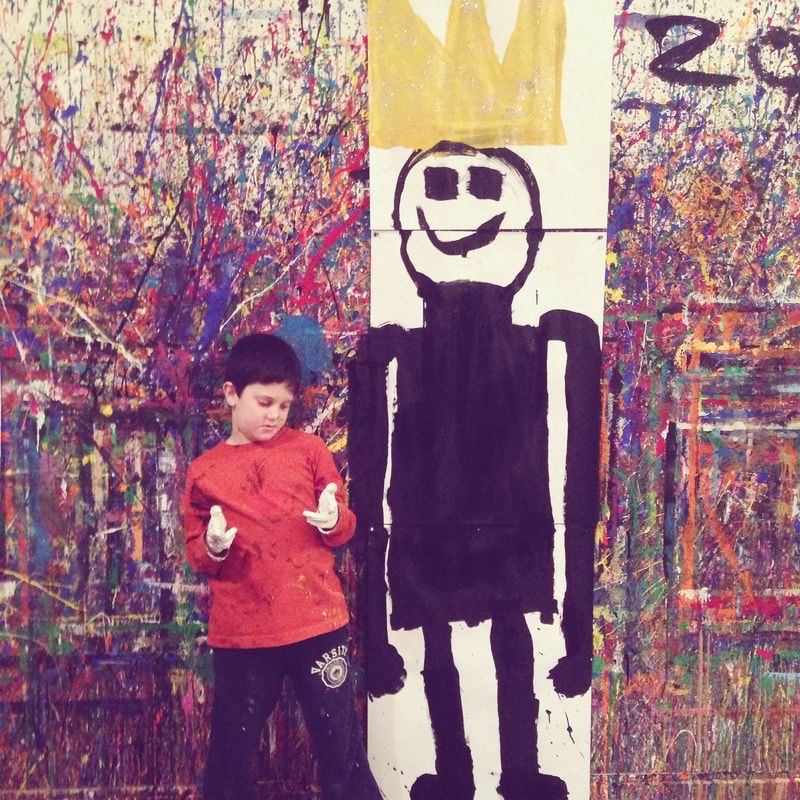
Media
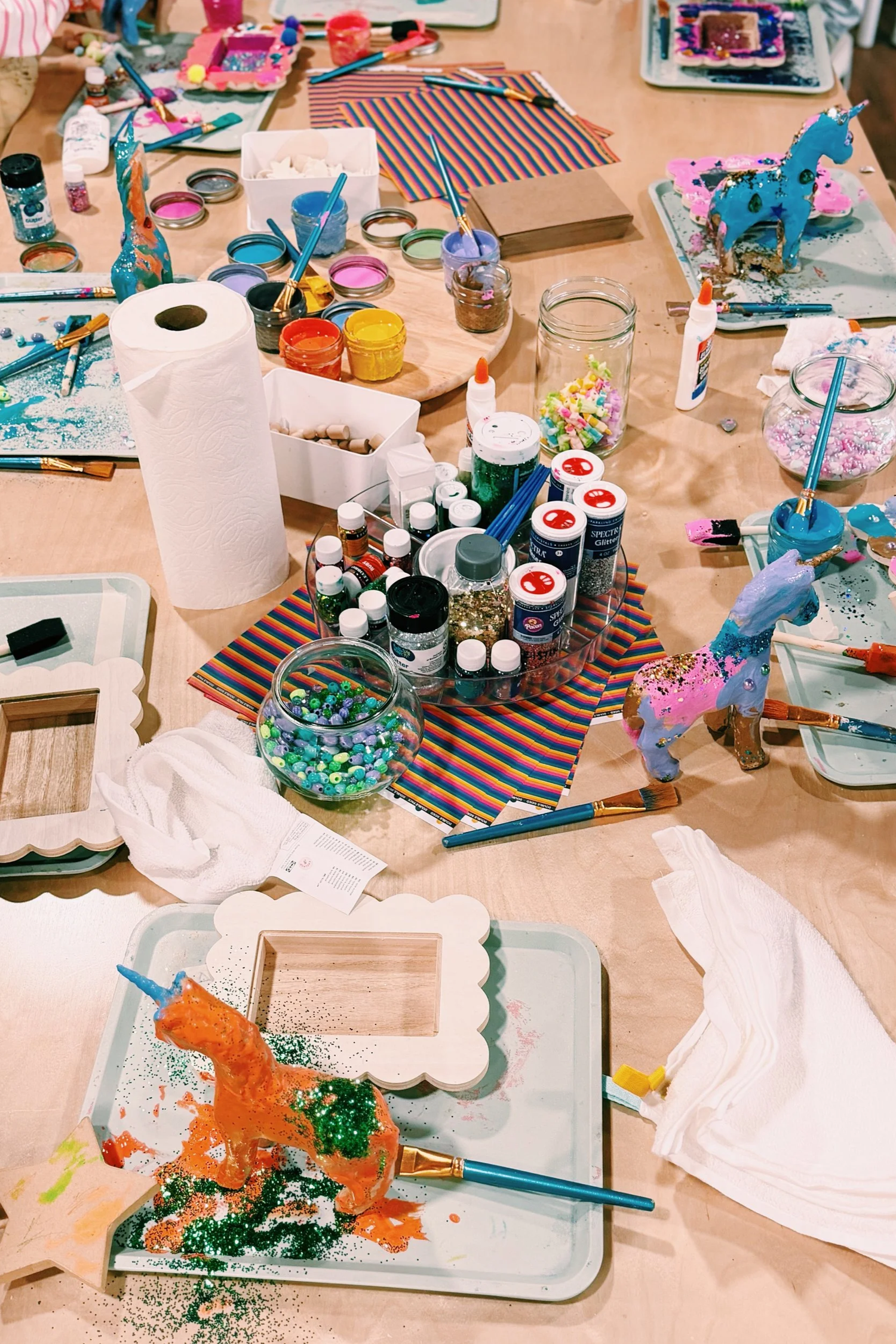 No-School-Day Art Camp
Show details
- Category tile (Hannah, October 8, after shop.com’s category groups), built for Explore, where the discovery header’s shortcuts replaced it on October 13 (the shortcuts left on October 19). It is tinted, not a photo, so its groups were a quiet break between the photo shelves: 72px tall, the accent’s hue at one OKLCH lightness and chroma for every tone (light and vivid on the light page, deep on the dark page; Hannah chose this over washes into the surface, which grayed the accents), the name centered in the ink; hover deepens it a step. Explore groups four under a theme (Get moving; Make & create), two across on a phone and four on web, never three, so the rows are always full, and gives each the next accent so no two neighbors match.
- With a photo instead: the photo under a soft dark shade with the name in white (--schools-out-color-ink-on-photo over --schools-out-color-photo-shade, the same in both appearances, as photos are), 12 to 5, 72px tall on a phone and 112px at the widest. Hover eases the photo in; reduced motion keeps it still.
Metric
One key number and how it changed, or a count you can tap to filter a list.
Bookings this week128
Activities for ages 6–1034
Sessions this month42
As filter cards: activities for each age, narrowing a list
Show details
- trend colors the change: green for up, red for down, gray for flat.
Table
Rows and columns for comparing activities and sessions. Sort by a column, open a row, or act on it.
Finding an activity: one row per activity, sortable, each opening its business, with Save

Show details
- Sizes: compact, default, and comfortable for rows with photos (Table item). Numbers align right. Scrolls sideways when the columns do not fit.
- Spacious (Hannah, November 1, for Explore’s Upcoming registrations): 24px above and below each row, for a few rich rows, each a logo, words, and its own buttons, that a parent reads one at a time.
- Row alignment (Hannah, November 1): rowAlign top starts every cell at the row’s top edge, for rows whose cells are different heights (three lines beside one), so their first lines read across as one line. Centered is the default.
Table item
Not in use yetRetained for design review. No consumer screen uses this component.
The first cell of a row: a photo, the title with a status, and a line or two of detail.
No-School-Day Art Camp2 spots leftHappy MakersSchool holidays · 9am–3pm Creative Studio ClassesHappy MakersACAva ChenAge 8Saved 3 activitiesFree on no-school days
Show details
- The photo is 56px, or 40px at size small for compact tables.
Pagination
Not in use yetRetained for design review. No consumer screen uses this component.
Pages for a long list: what is showing, then the previous page, the pages, and the next.
Under a table, five rows a page
| Save | ||||
|---|---|---|---|---|
| No-School-Day Art CampHappy MakersSchool holidays · 9am–3pm | 6–10 | Oct 9 | From $953 sessions | |
| Creative Studio ClassesHappy MakersSaturday · 10am–12pm | 5–9 | Oct 3–24 | From $1452 sessions | |
 Open StudioHappy MakersWeekend sessions · 90 minutes | All ages | Oct 10 · 10am | From $253 sessions | |
 S.T.E.A.M. Discovery CampExperiment PDXSchool holidays · 9am–3pm | 6–10 | Oct 9 | From $953 sessions | |
 Science BuddyExperiment PDXAfter school · 1-hour sessions | Grades 2–5 | Oct 3–24 | From $402 sessions |
First, middle, and last of twelve pages
On a phone (343px), and one page
Show details
- From Figma (2564-10453, October 5): previous, the pages, and next on one pill track, each a 38px control, 2px apart, 4px inside the track. The current page sits on the surface in full ink; the others are muted. Figma’s blue-gray track is the library’s neutral card fill, and its 15px numbers the button label size.
- Five page slots at most: every page up to five, else the first, the last, and the current page, with ••• where pages are skipped (1 2 3 ••• 12, 1 ••• 6 ••• 12, 1 ••• 10 11 12). So it fits a phone.
- On touch screens each control keeps its 38px look and gets a 44px hit area, and the track opens to 8px between controls so hit areas never overlap; in a frame narrower than 330px it keeps 2px.
- A table shows five rows at a time (Hannah, October 2); Pagination sits under it, the count on the left. With one page only the count shows.
Carousel dots
Not in use yetRetained for design review. No consumer screen uses this component.
Dots under a set of photos: the one showing is a short pill. Tap a dot to show its photo.
Photo 1 of 4
Show details
- From Figma’s business card (2717:7019, October 7): on a business page’s top section, the dots at the panel’s foot show each of the business’s photos, up to five.
- Rings in the ink of the text around them, so they read on glass and on a page; the current one is a 16px filled pill. Each dot keeps a 24 by 36px hit area. One photo or none, and nothing shows.
- Not in use yet since October 26 (Hannah), when the business page’s photo hero left with the Business page header.
Photo row
A row of square photos. More than fit scroll sideways.
Show details
- Hannah, October 14, the activity page’s Photos: one row, every photo the same square, four across in a wide column and two and a bit on a phone, so the next one peeks in. No arrows or counts: more scroll sideways and snap to a photo.
- Each square sits on the pale fill with the photo edge drawn over it; a photo that fails to load leaves its square empty.
Tabs
Switch between related views without leaving the page.
A Portland art studio for kids and grown-ups, with creative classes, no-school-day camps, open studio time, and celebrations.
School holidays · 9am–3pm. Saturday · 10am–12pm. Weekend sessions · 90 minutes.
2729 NE Broadway, Portland, OR
Show details
- Hannah, October 9, after Cosmos’s search tabs: the tabs sit in an outlined pill, and the current one on a soft fill that slides to the tab chosen. Labels are the button size in Medium in the ink.
- The page header system: a main destination (Plans, Explore, Feed, Collections) has no visible title, so its tabs lead the header row on the left, with the page’s actions on the right (Collections: Collections and Saved, then New collection).
- Small, with 36px tabs and body type, fits four tabs across a phone. Not in use yet: no screen has four tabs since October 19. Use a segmented control instead to switch how one list is shown, like Explore’s Grid and Map.
Show more
Keep extra detail out of the way until someone asks for it.
What should my child bring?
Lunch, a water bottle, and clothes that can get messy.
Can I cancel?
Yes. Cancel up to 7 days before for a full refund.
Truncated text
Long text cut to a few lines, ending in See more.
A school-holiday day camp at a hands-on science and art museum. Campers explore its tactile exhibits, build with clay and circuits, and spend the afternoon on a project they take home. Bring a lunch and a water bottle; the museum has a shaded courtyard for breaks, and the staff keep groups small so every child gets a turn at each station.
Show details
- Hannah, October 19, the activity page’s About: at most six lines, the last ending in “… See more”, an underlined text button in line with the words, as Airbnb cuts a listing’s description. See more shows the whole text, with See less after it. Short text shows whole, with no button.
Dialog
Not in use yetRetained for design review. No consumer screen uses this component.
A focused window for a quick decision. The page behind waits until it closes.
Sheet
A panel for one task that stays inside its screen: from the bottom on a phone, from the side on a wide screen.
Show details
- From the bottom on a phone and from the side on a wide screen; center is for a short decision, and on a phone it is a card 12px in from the sides and the foot.
- It rises on the drawer curve in 320ms and leaves faster, the way it came (October 11). On a phone it follows a drag on its handle or header and closes past 120px or on a quick flick.
- Hairlines under the header and over the actions show only once the content scrolls under them.
Docked sheet
A list docked over a map’s foot that leaves the map usable: low, half open, or full.
Show details
- Explore’s map on a phone (October 27, after Airbnb’s and Google Maps’ map sheets): the map fills the screen and the list rests over its foot. Unlike Sheet it is not a dialog: nothing is dimmed, and the map stays usable behind it.
- Three heights: low, its handle and title only; half its surface; and full, the surface’s whole height, the map hidden behind it (Hannah, October 30: a parent can raise it to see everything available; low and half only before). Explore opens it half open (Hannah, October 30: the list is what a parent came for).
- With no title the grip is the handle alone, a tap target tall (Hannah, October 30: Explore’s count moved over the filters, so the sheet doesn’t repeat it); a chosen place names it.
- A tap on the handle or the title steps it: low to half, half to full, and full back to half, so a tap never hides the list; a drag follows the finger and settles on the nearest height.
Message
One message in a conversation with Mellow or a group.
Can you find an activity for Maya on Friday, October 16?
I found three that fit. All run Friday, October 16 and take 8-year-olds.
We’re going on the 16th too.
Show details
- Your messages sit on the right in the fill; Mellow and other people sit on the left on the floating surface.
- Since October 9 (Vani, from the app): a 24px card with a 4px tail corner toward its sender, on a soft shadow and no border. The corner sits top left on Mellow’s and other people’s messages, pointing up to their name (Hannah, October 9), and bottom right on your own, which carry no name.
Overview card
Not in use yetRetained for design review. No consumer screen uses this component.
Who a business is and what stands out, at the top of its page, and what an activity is and who offers it.
On the business’s page
Portland, Oregon
- Hands-on science and art
- Science Buddy for grades 2–5
- Birthday parties and community events
About the business
Experiment PDX brings science and art together through tactile exhibits, making, and experimentation. The museum also hosts birthday parties, community events, and programs for children and adults.
Its Science Buddy program introduces second- through fifth-graders to topics in physics, biology, chemistry, and Earth science while encouraging questions and critical thinking.
On an activity, not in use yet: what it is, then who offers it
About S.T.E.A.M. Discovery Camp
A school-holiday day camp at Experiment PDX, a hands-on science and art museum in Southeast Portland. Campers explore its tactile exhibits and spend the day making and experimenting across science and art.
- Ages 6–10Science and art
- 9 am–3 pmDay camp
- Buckman12 min drive
Show details
- The business page’s overview: the logo, the name (it opens the business’s page), and the city on top, then the business’s highlights, then About and the business’s email and phone, which open the device’s own apps.
- On an activity (Hannah, October 12) it leads with what the activity is: its About and its own description, then Offered by and the business as a pill (Business byline), then its facts (ages, hours, and where) and the business’s contact line. No city: the Location section says where it is. Not in use yet: since October 19 the activity page has no overview card, and PRODUCT.md rules out an About-the-business card there.
- Highlights sit three across from 420px of the card’s width, side by side in rows from 640px, one under another on a phone.
- Not in use yet on the business page either since October 26 (Hannah), when it became the business page test’s design: its About, Highlights, and contact line are cards of their own.
Business byline
Not in use yetRetained for design review. No consumer screen uses this component.
Who offers an activity: the business’s logo beside its name.
Show details
- Hannah, October 12: the logo sat far above the business’s name in the activity hero, so the two didn’t read as one. Now the logo sits right beside the name, with Offered by in front.
- In a line of its own (the activity hero), the logo leads and the name is an underlined link in the lead type. As a pill (the activity’s About card), Offered by comes first, then a round pill with the logo and the name, which presses like any control. Not in use yet: since October 19 the activity page’s title card names the business in a Hosted by link of its own.
- As a row (Hannah, October 15, after Airbnb’s Hosted by), Offered by in the activity page’s right column (PRODUCT.md) and in direction D of the activity page test (October 22 and 23): the logo beside Offered by and the name in the section type, a muted line under them (what the business is and how many activities it has), and a chevron. The whole row opens the business’s page.
- Either way the name opens the business’s page.
Task card
Not in use yetRetained for design review. No consumer screen uses this component.
A job Mellow does for the parent, shown as one card that updates as it goes. Not in use yet: booking moved to the booking module on October 11.
S.T.E.A.M. Discovery Camp
Experiment PDX · for Maya
I have everything Experiment PDX asks for. Check it over, then approve.
S.T.E.A.M. Discovery Camp
Experiment PDX · for Maya
- Filled in 8 details, Done
- Visa ending 4242 is good, Done
- Sending it to Experiment PDX, In progress
- Waiting for Experiment PDX to confirm, Not started
S.T.E.A.M. Discovery Camp
Experiment PDX · for Maya
Maya is booked for Fri, Oct 16. Saved to Maya’s profile: T-shirt size.
S.T.E.A.M. Discovery Camp
Experiment PDX · for Maya
The last spot on Fri, Oct 16 went before Experiment PDX confirmed. Nothing was charged.
Show details
- One card that changes in place, not a new message for every step, so the parent always sees where the task stands (Hannah, October 8, for Book with Assistant).
- The header names what the task acts on, for whom, and its status in a word or two: Needs you, Ready to approve, Booking, Booked, Not booked.
- Nothing is sent or paid before the parent approves; the line under the actions says when money moves. The main action is last.
Filled detail
Not in use yetRetained for design review. No consumer screen uses this component.
A detail Mellow filled in, with where it came from.
- Emergency contactsRuth Bello · Priya NguyenFrom Maya’s profile
- GuardiansJordan Okafor · (503) 555-0148From your account
- Allergies and medicineNoneFrom you, for this booking
Show details
- Nothing an assistant sends for the parent appears without its source: the child’s profile, the account, or the parent’s own change for this booking (Hannah, October 8).
- Edit lets the parent change it for this booking, and save it to the profile by the same rules as a Detail request.
Side panel
A floating panel beside the page on a wide screen. The page narrows and stays in use.
Show details
- Beside the page, not over it (Hannah, October 8): the page narrows and stays in use, so what a parent does in the panel lands on the page as they watch. A collection’s Add more activities opens it (November 2).
- From 768px of the frame, wherever the page has room beside it (Hannah, November 2: a tablet got an overlay before). A phone has no room beside the page, so the same content rises from the bottom as a Sheet.
- A floating container (Hannah, November 2: the hairline it had at the page’s edge read as outdated): the floating surface with its shadow and the container radius, inset 12px from the edges. No scrim, since the page stays in use.
Icons
One icon set, Amicons, in its round line style. Icons take the color of the text around them.
Amicons, round line, 114 icons
alert
apple
arrow left
arrow right
arrow up
arrow up right
ball
bell
bike
bookmark
bus
calendar
calendar check
calendar plus
calendar x
camera
car
card
chat
check
check circle
chevron down
chevron left
chevron right
chevron up
circle
clock
close
code
compass
contrast
copy
download
edit
external
eye
eye off
facebook
feed
filter
first aid
flag
folder
gif
gift
globe
google
grid
heart
help
home
image
info
key
kid star
laptop
life buoy
link
link off
list
lock
logout
mail
mail check
map pin
masks
menu
mic
minus
moon
more
mountain
music
navigate
palette
paw
phone
plus
receipt
refresh
reply
robot
school
science
search
search off
send
settings
share
shield
smile
sort
sparkle
star
stop
store
sun
tag
thumbs down
trash
tree
user
user plus
users
utensils
verified
walk
wallet
waves
web
whatsapp
wheelchair
x circle
x logo
Filled, for a saved, liked, or chosen state and the current tab
heart
bookmark
star
home
feed
compass
Show details
- Amicons Pro 2.0 in the round line style (October 15, Rishav), the style Explore’s redesign brought in: one family everywhere, with rounded ends and corners. It replaced Chunk and the Material Symbols fallback.
- Heart, bookmark, star, home, feed, and compass also have the round solid style, for a saved, liked, or chosen state and the current tab of the phone’s bottom bar.
- Sizes are the icon’s box, and the icon’s 24px grid fills it. With a label, icons are 16, 18, or 20px; alone, 16, 20, or 24px. 12px sits inside small text, and 32px is for a placeholder or a focus card’s mark.
- Where Amicons has no exact icon, the nearest stands in: a plain calendar for add to or remove from a calendar, an envelope for an email that was read, and a ticket for theater.
Topic marks
Small illustrations that show what a feed post is about, or a page section, at a glance.
Roads and closures
Detours
Buses and transit
Rain
Sun and heat
Snow days
Wind and air quality
School calendar
Libraries and reading
Parks
Animals and nature
Water and swimming
Science
Art
Music
Theater
Sports
Food
Festivals and fairs
Camp news
Showcases and open houses
Seasonal
Announcements
A Mellow pick
Where it is (a page section)
Things to know (a page section)
Photos (a page section)
At a glance (a page section)
Highlights (a page section)
Show details
- Since October 15 (Hannah) they also sit beside a page’s section headings, at 32px (PageSection’s mark): the activity page’s Sessions (the school calendar), About this activity (the topic of its category), Location, Things to know, and Photos. Five are page marks drawn for pages, not feed topics, so a post is never tagged with one: a folded map under a pin, a clipboard with a checklist, a camera, a star (Hannah, October 19, beside the price at the top of the activity page’s sessions), and a thumbs up (Hannah, October 21, for a business’s highlights on the business page test).
- After Muse’s feed and a flat illustrated icon set Hannah shared (October 7): a 36px tile, often split into two color fields, with one object that may break past its edge, in a 48px box. One fine navy line (0.8) and only School’s Out colors: the five accents, a light tint of each, and white.
- A fixed set, one per topic, so a mark means the same thing every time and parents learn to read the feed by them. Mellow’s picks add its sparkle in the corner. They stay the same in light and dark, as photos do.